4.1 KiB
Exercise 3 Decision boundary
The goal of this exercise is to learn to fit a logistic regression on simple examples and to understand how the algorithm separated the data from the different classes.
1 dimension
First, we will start as usual with features data in 1 dimension. Use make classification from Scikit-learn to generate 100 data points:
X,y = make_classification(
    n_samples=100,
    n_features=1,
    n_informative=1,
    n_redundant=0,
    n_repeated=0,
    n_classes=2,
    n_clusters_per_class=1,
    weights=[0.5,0.5],
    flip_y=0.15,
    class_sep=2.0,
    hypercube=True,
    shift=1.0,
    scale=1.0,
    shuffle=True,
    random_state=88
)
Warning: The shape of X is not the same as the shape of y. You may need (for some questions) to reshape X using: X.reshape(1,-1)[0].
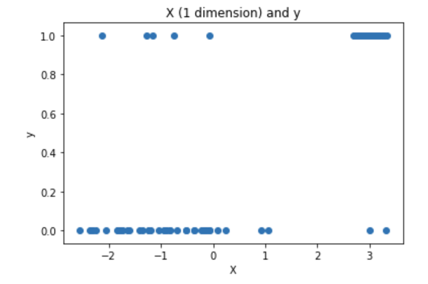
- Plot the data using a scatter plot. The x-axis contains the feature and y-axis contains the target.
The plot should look like this:
-
Fit a Logistic Regression on the generated data using scikit learn. Print the coefficients and the interception of the Logistic Regression.
-
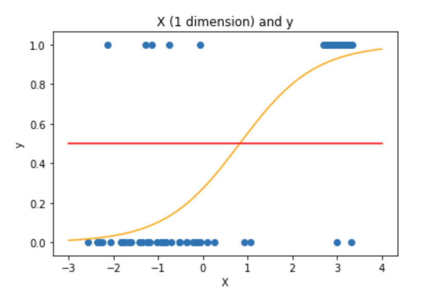
Add to the previous plot the fitted sigmoid and the 0.5 probability line. The plot should look like this:
- Create a function
predict_probabilitythat takes as input the data point and the coefficients and that returns the predicted probability. As a reminder, the probability is given by:p(x) = 1/(1+ exp(-(coef*x + intercept))). Check you have the same results as the methodpredict_probafrom Scikit-learn.
def predict_probability(coefs, X):
    '''
    coefs is a list that contains a and b: [coef, intercept]
    X is the features set

    Returns probability of X
    '''
    #TODO
    probabilities =

    return probabilities
-
Create a function
predict_classthat takes as input the data point and the coefficients and that returns the predicted class. Check you have the same results as the class methodpredictoutput on the same data. -
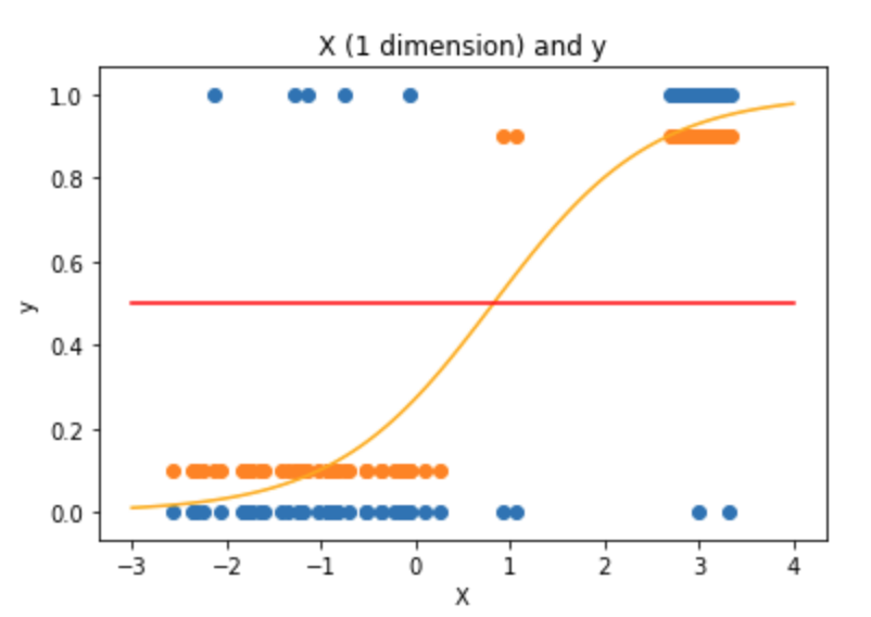
On the plot add the predicted class. The plot should look like this (the predicted class is shifted a bit to make the plot more understandable, but obviously the predicted class is 0 or 1, not 0.1 or 0.9) The plot should look like this:
2 dimensions
Now, let us repeat this process on 2-dimensional data. The goal is to focus on the decision boundary and to understand how the Logistic Regression create a line that separates the data. The code to plot the decision boundary is provided, however it is important to understand the way it works.
- Generate 500 data points using:
X, y = make_classification(n_features=2,
                           n_redundant=0,
                           n_samples=250,
                           n_classes=2,
                           n_clusters_per_class=1,
                           flip_y=0.05,
                           class_sep=3,
                           random_state=43)
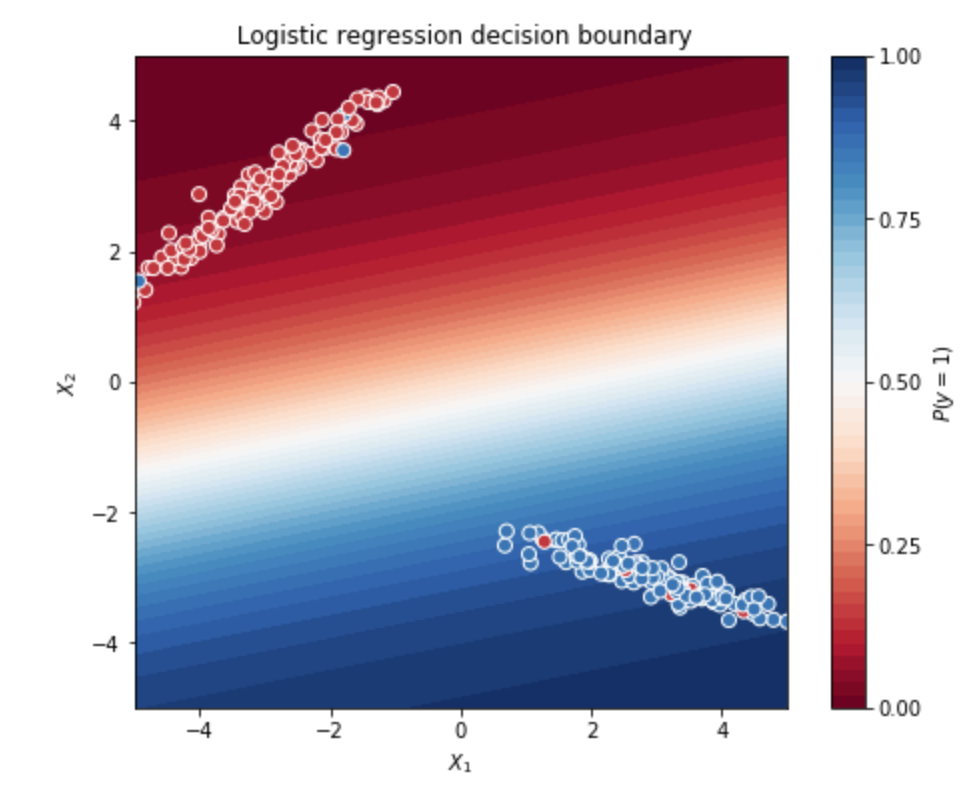
- Fit the Logistic Regression on X and y and use the code below to plot the fitted sigmoid on the data set.
The plot should look like this:
xx, yy = np.mgrid[-5:5:.01, -5:5:.01]
grid = np.c_[xx.ravel(), yy.ravel()]
#if needed change the line below
probs = clf.predict_proba(grid)[:, 1].reshape(xx.shape)

f, ax = plt.subplots(figsize=(8, 6))
contour = ax.contourf(xx, yy, probs, 25, cmap="RdBu",
                      vmin=0, vmax=1)
ax_c = f.colorbar(contour)
ax_c.set_label("$P(y = 1)$")
ax_c.set_ticks([0, .25, .5, .75, 1])

ax.scatter(X[:,0], X[:, 1], c=y, s=50,
           cmap="RdBu", vmin=-.2, vmax=1.2,
           edgecolor="white", linewidth=1)

ax.set(aspect="equal",
       xlim=(-5, 5), ylim=(-5, 5),
       xlabel="$X_1$", ylabel="$X_2$")
The plot should look like this:


