|
|
1 year ago | |
|---|---|---|
| .. | ||
| audit | 1 year ago | |
| README.md | 1 year ago | |
| w1day03_ex1_plot1.png | 1 year ago | |
| w1day03_ex2_plot1.png | 1 year ago | |
| w1day03_ex3_plot1.png | 1 year ago | |
| w1day03_ex4_plot1.png | 1 year ago | |
| w1day03_ex5_plot1.png | 1 year ago | |
| w1day03_ex6_plot1.png | 1 year ago | |
| w1day03_ex7_plot1.png | 1 year ago | |
README.md
Visualizations
While working on a dataset it is important to check the distribution of the data. Obviously, for most of humans it is difficult to visualize the data in more than 3 dimensions
"Viz" is important to understand the data and to show results. We'll discover three libraries to visualize data in Python. These are one of the most used visualisation "libraries" in Python:
- Pandas visualization module
- Matplotlib
- Plotly
The goal is to understand the basics of those libraries. You'll have time during the project to master one (or the three) of them. You may wonder why using one library is not enough. The reason is simple: it depends on the usage. For example if you want to check the data quickly you may want to use Pandas viz module or Matplotlib. If you want to plot a custom and more elaborated plot I suggest to use Matplotlib or Plotly. And, if you want to create a very nice and interactive plot I suggest to use Plotly.
Exercises of the day
- Exercice 0: Environment and libraries
- Exercise 1: Pandas plot 1
- Exercise 2: Pandas plot 2
- Exercise 3: Matplotlib 1
- Exercise 4: Matplotlib 2
- Exercise 5: Matplotlib subplots
- Exercise 6: Plotly 1
- Exercise 7: Plotly Box plots
Virtual Environment
- Python 3.x
- NumPy
- Pandas
- Matplotlib
- Plotly
- Jupyter or JupyterLab
I suggest to use the most recent version of the packages.
Resources
Exercise 0: Environment and libraries
The goal of this exercise is to set up the Python work environment with the required libraries.
Note: For each quest, your first exercice will be to set up the virtual environment with the required libraries.
I recommend to use:
- the last stable versions of Python.
- the virtual environment you're the most confortable with.
virtualenvandcondaare the most used in Data Science. - one of the most recents versions of the libraries required
- Create a virtual environment named
ex00, with a version of Python >=3.8, with the following libraries:pandas,numpy,jupyter,matplotlibandplotly.
Exercise 1: Pandas plot 1
The goal of this exercise is to learn to create plots with use Pandas. Panda's .plot() is a wrapper for matplotlib.pyplot.plot().
Here is the data we will be using:
        df = pd.DataFrame({
        'name':['christopher','marion','maria','mia','clement','randy','remi'],
        'age':[70,30,22,19,45,33,20],
        'gender':['M','F','F','F','M','M','M'],
        'state':['california','dc','california','dc','california','new york','porto'],
        'num_children':[2,0,0,3,8,1,4],
        'num_pets':[5,1,0,5,2,2,3]
        })
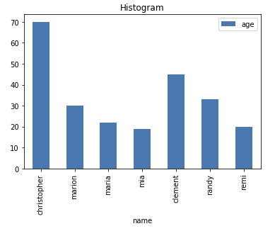
- Reproduce this plot. This plot is called a bar plot.
The plot has to contain:
- the title
- name on x-axis
- legend
Exercise 2: Pandas plot 2
The goal of this exercise is to learn to create plots with use Pandas. Panda's .plot() is a wrapper for matplotlib.pyplot.plot().
        df = pd.DataFrame({
        'name':['christopher','marion','maria','mia','clement','randy','remi'],
        'age':[70,30,22,19,45,33,20],
        'gender':['M','F','F','F','M','M','M'],
        'state':['california','dc','california','dc','california','new york','porto'],
        'num_children':[4,2,1,0,3,1,0],
        'num_pets':[5,1,0,2,2,2,3]
        })
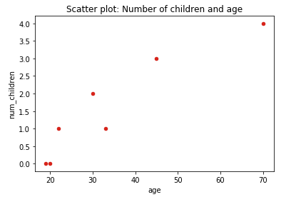
- Reproduce this plot. This plot is called a scatter plot. Do you observe a relationship between the age and the number of children ?
The plot has to contain:
- the title
- name on x-axis
- name on y-axis
Exercise 3: Matplotlib 1
The goal of this plot is to learn to use Matplotlib to plot data. As you know, Matplotlib is the underlying library used by Pandas. It provides more options to plot custom visualizations. Howerver, most of the plots we will create with Matplotlib can be reproduced with Pandas' .plot().
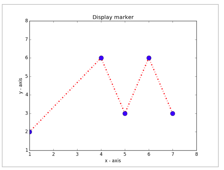
- Reproduce this plot. We assume the data points have integers coordinates.
The plot has to contain:
- the title
- name on x-axis and y-axis
- x-axis and y-axis are limited to [1,8]
- style:
- red dashdot line with a width of 3
- blue circles with a size of 12
Exercise 4: Matplotlib 2
The goal of this plot is to learn to use Matplotlib to plot different lines in the same plot on different axis using twinx. This very useful to compare variables in different ranges.
Here is the data:
left_data = [5, 7, 11, 13, 17]
right_data = [0.1, 0.2, 0.4, 0.8, -1.6]
x_axis = [0.0, 1.0, 2.0, 3.0, 4.0]
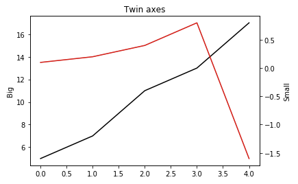
- Reproduce this plot
The plot has to contain:
- the title
- name on left y-axis and right y-axis
- style:
- left data in black
- right data in red
Exercise 5: Matplotlib subplots
The goal of this exercise is to learn to use Matplotlib to create subplots.
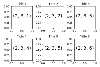
- Reproduce this plot using a for loop:
The plot has to contain:
-
6 subplots: 2 rows, 3 columns
-
Keep space between plots:
hspace=0.5andwspace=0.5 -
Each plot contains
- Text (2,3,i) centered at 0.5, 0.5. Hint: check the parameter
haoftext - a title: Title i
- Text (2,3,i) centered at 0.5, 0.5. Hint: check the parameter
Exercise 6: Plotly 1
Plotly has evolved a lot in the previous years. It is important to always check the documentation.
Plotly comes with a high level interface: Plotly Express. It helps building some complex plots easily. The lesson won't detail the complex examples. Plotly express is quite interesting while using Pandas Dataframes because there are some built-in functions that leverage Pandas Dataframes.
The plot outputed by Plotly is interactive and can also be dynamic.
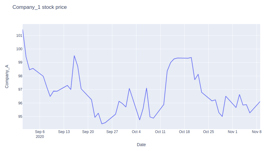
The goal of the exercise is to plot the price of a company. Its price is generated below.
returns = np.random.randn(50)
price = 100 + np.cumsum(returns)

dates = pd.date_range(start='2020-09-01', periods=50, freq='B')
df = pd.DataFrame(zip(dates, price),
                  columns=['Date','Company_A'])
- Using Plotly express, reproduce the plot in the image. As the data is generated randomly I do not expect you to reproduce the same line.
The plot has to contain:
- title
- x-axis name
- y-axis name
- Same question but now using
plotly.graph_objects. You may need to useinit_notebook_modefromplotly.offline.
https://plotly.com/python/time-series/e
Exercise 7: Plotly Box plots
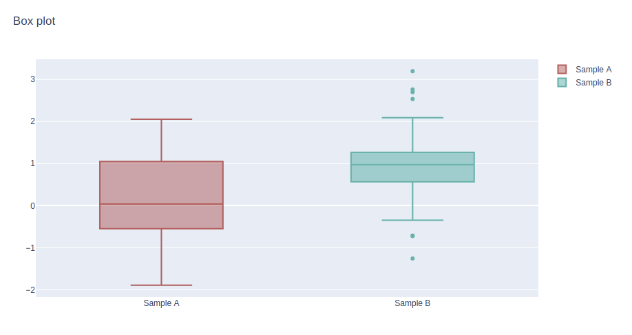
The goal of this exercise is to learn to use Plotly to plot Box Plots. It is t is a method for graphically depicting groups of numerical data through their quartiles and values as min, max. It allows to compare quickly some variables.
Let us generate 3 random arrays from a normal distribution. And for each array add respectively 1, 2 to the normal distribution.
y0 = np.random.randn(50)
y1 = np.random.randn(50) + 1 # shift mean
y2 = np.random.randn(50) + 2
- Plot in the same Figure 2 box plots as shown in the image. In this exercise the style is not important.
The plot has to contain:
- the title
- the legend
